- Role: Art Direction, Design
- Client: TravisMathew
- Duration: 09/16 – 11/18
TravisMathew
TravisMathew
- Role: Art Direction, Design
- Client: TravisMathew
- Duration: 09/16 – Present
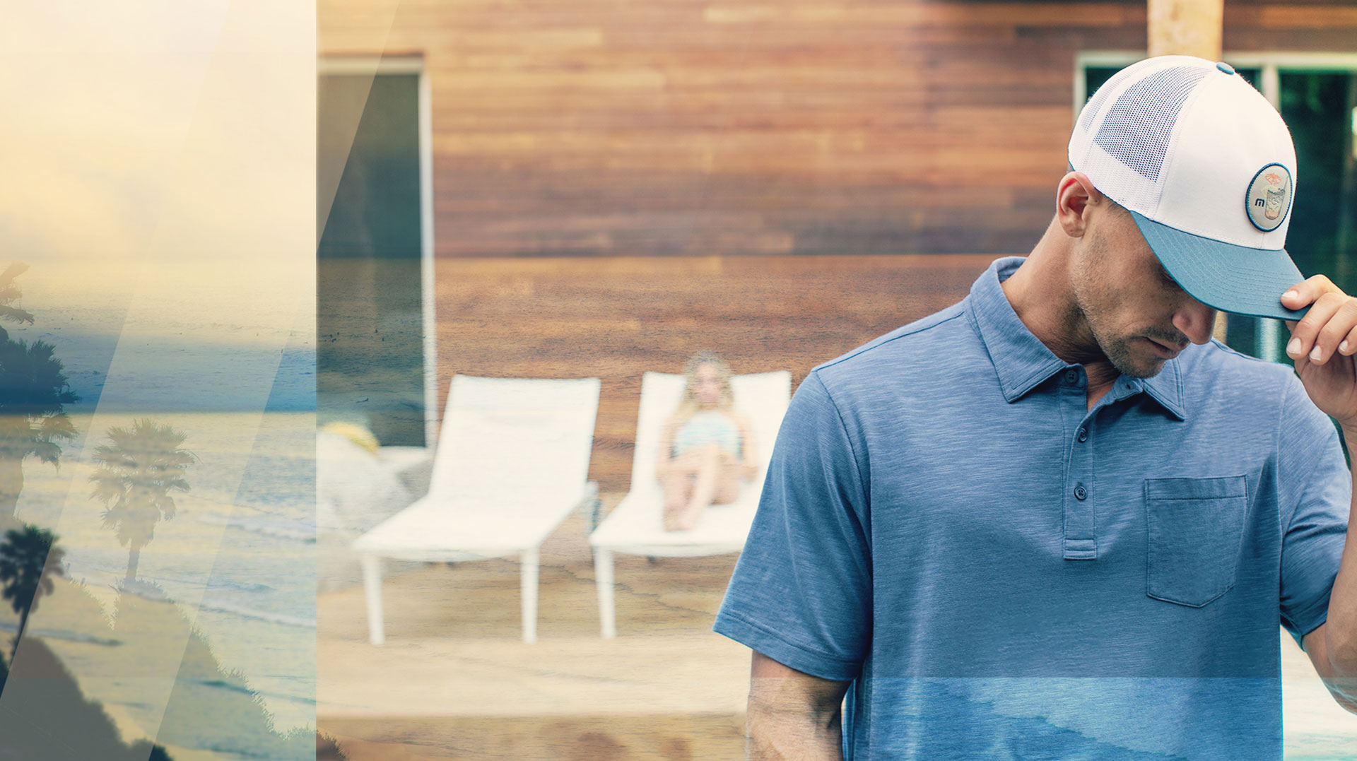
Founded in 2007, TravisMathew is a clothing brand which draws its inspiration from all aspects of Southern California culture and lifestyle. I was fortunate to lead a multitude of marketing projects at TravisMathew including monthly delivery launches, continual website updates, catalog creation along with social and email campaigns. Primarily a delivery launch would consist of aesthetic concepting, layout & photo treatment, as well as typeface & vector art development. Once a direction has been established it was up to me to delegate and coordinate with the Jr Designers to implement and execute consistently and effectively across all marketing platforms.

Mainline
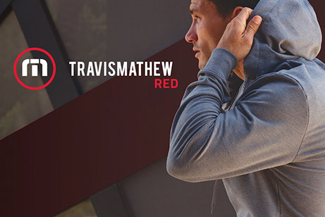
TM RED
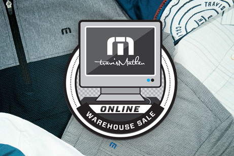
TM WAREHOUSE
Mainline
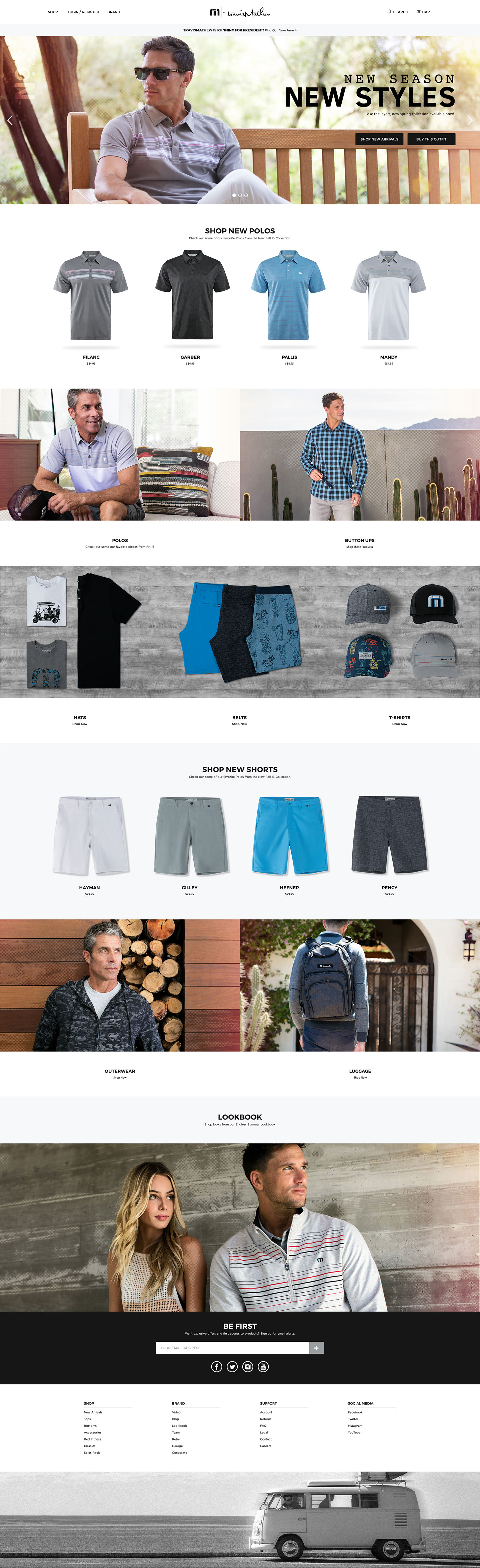
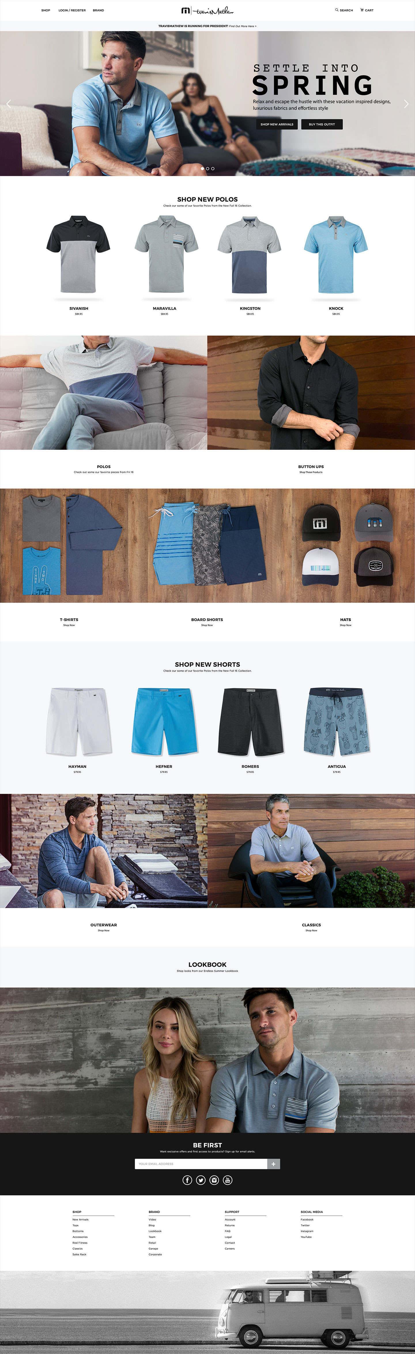
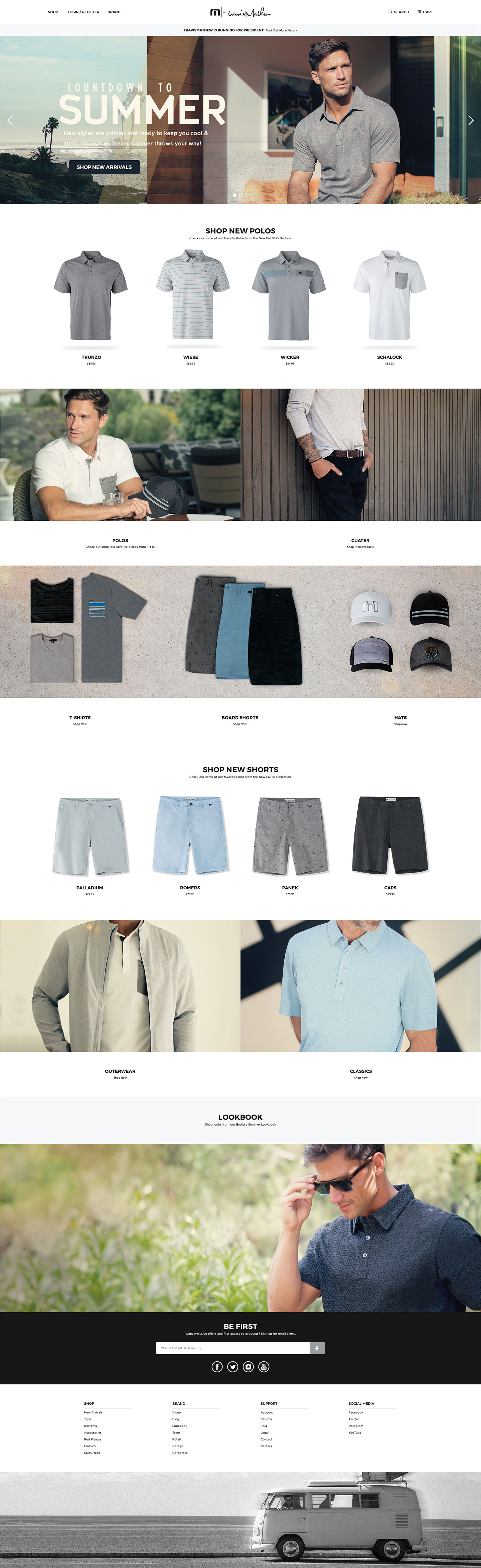
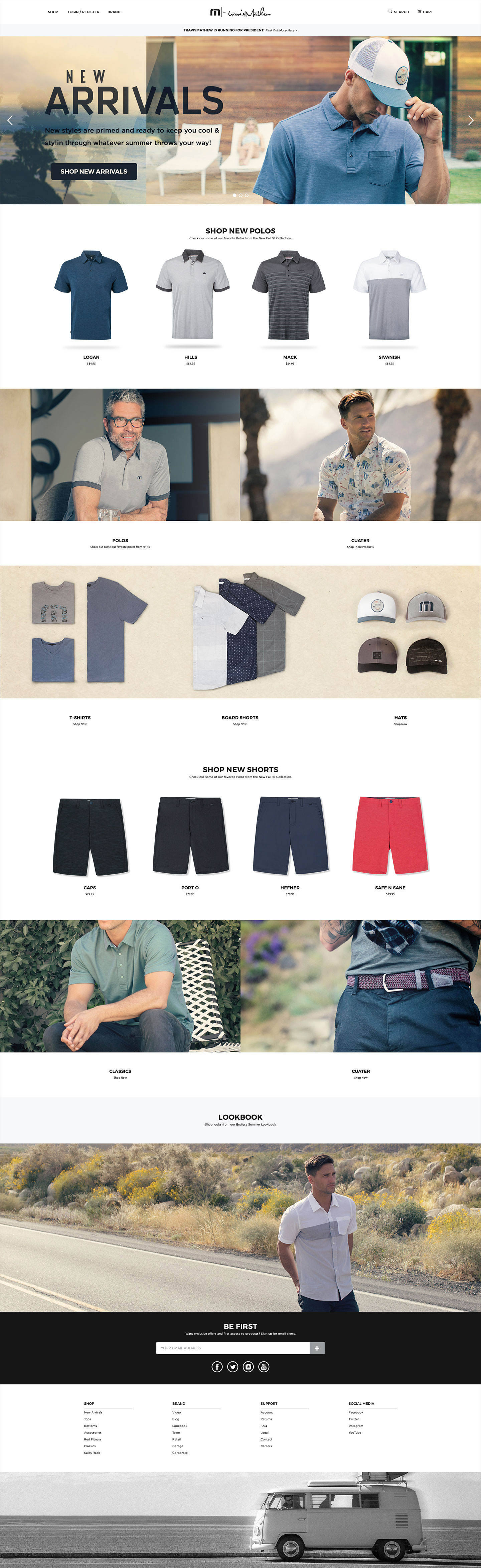
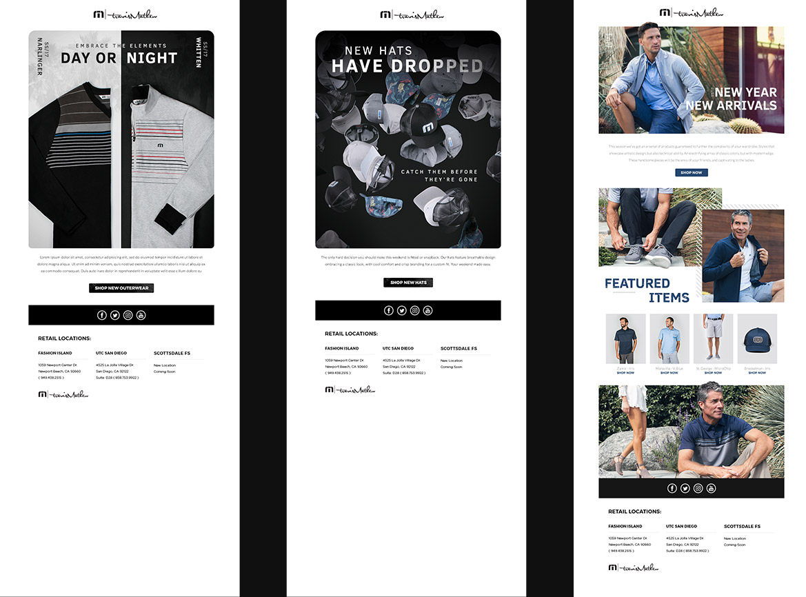
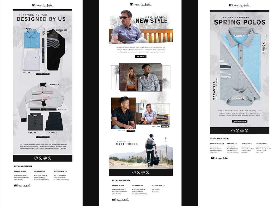
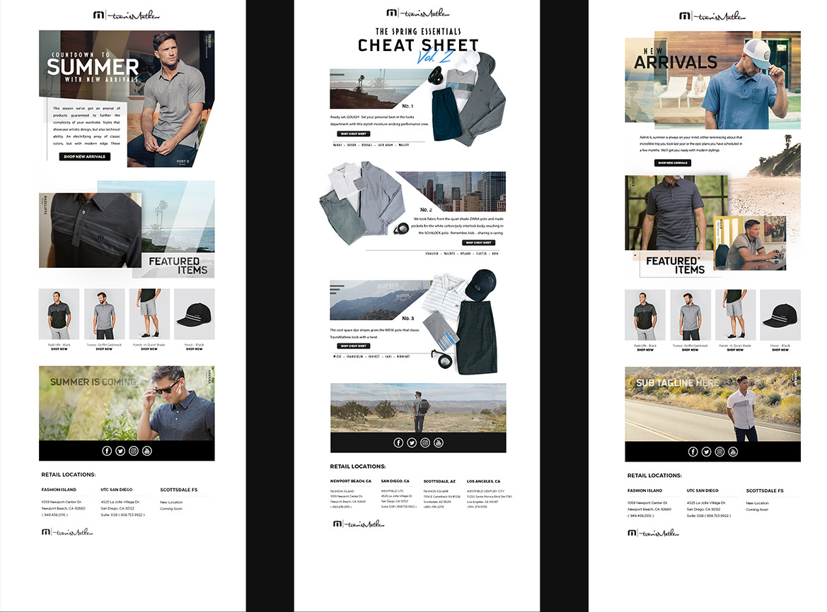
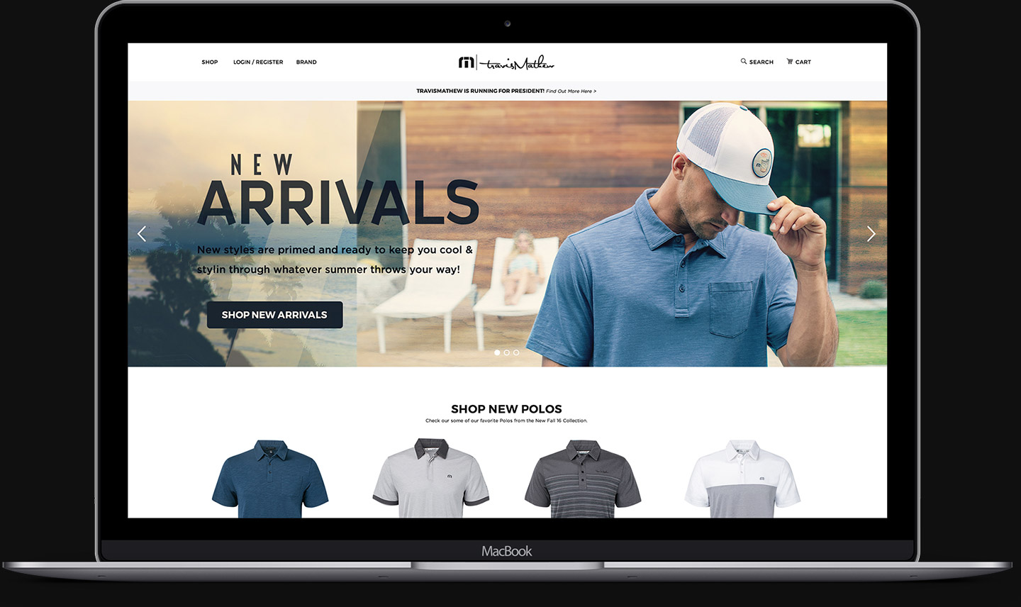
TravisMathew’s mainline is the primary apparel set for the brand consisting of alternating seasons Fall/Holiday and Spring/Summer. Each season has five deliveries each with a unique set of products released and each with a different color scheme associated with it. These individual aesthetics are what make up the marketing and visual designs developed to efficiently and creatively sell the line. This includes new homepage layouts, photography presets, typography, colorways and various additional email and social media assets.
- D1
- D2
- D3
- D4
- Wireframe
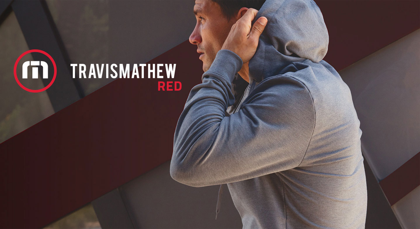
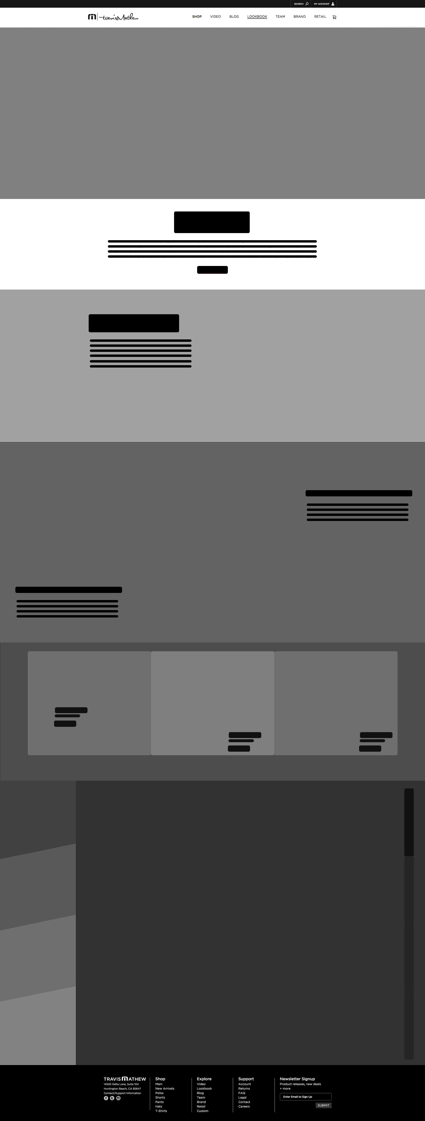
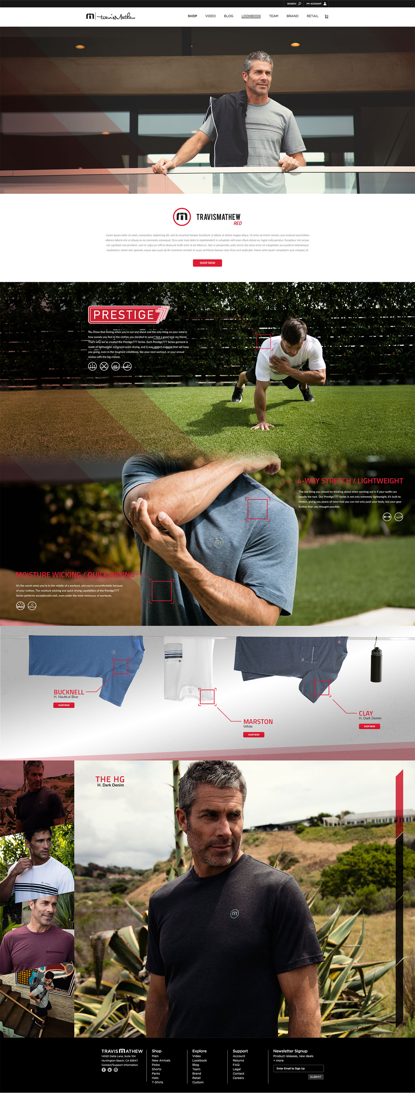
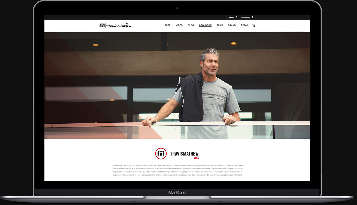
TM RED
TravisMathew Red is the activewear wing of the brand and it prides itself on the concept of “tech clothing”. For this very reason you will notice “tech” as a running theme throughout and the red colorway was an easy solution. The sportswear aspect called for a strong and clean layout with bold lines and smooth transitions.
- WIREFRAME
- Launch
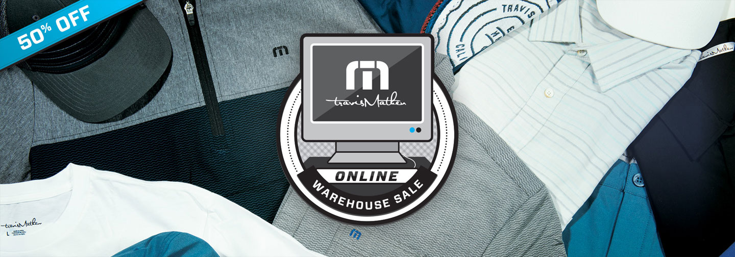
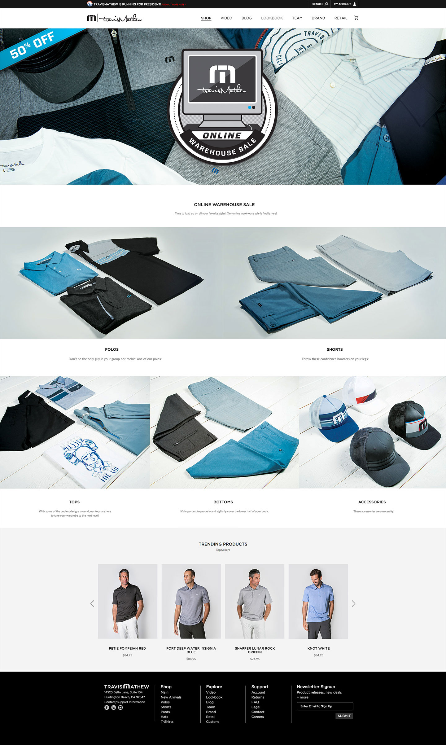
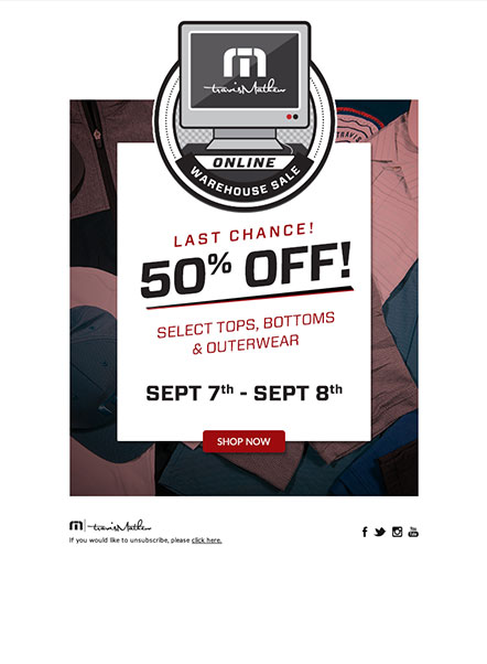
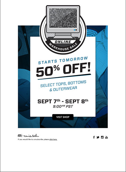
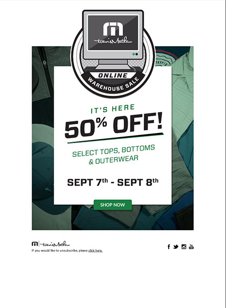
TM Online Warehouse Sale
The TravisMathew Online Wearhouse Sale turned out to be one of the more creatively inspiring projects during my time at TravisMathew due to my degree of creative freedom and with the success of the project. The colorways were developed from the color shades found in the product line and the photography and grids were created with a clean modern aesthetic in mind.
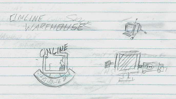
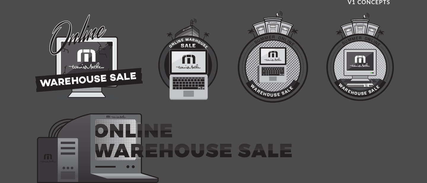
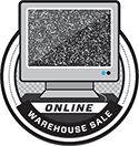
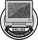
The initial concept for the logo started with the imagery of a computer breaking sale. Whether it meant a physically broken icon or a digitally one I wasn’t sure but several protos were created before moving in our final direction. I eventually decided that a clean illustration with a glitching screen would prove to be the most visually impactful and relatable.
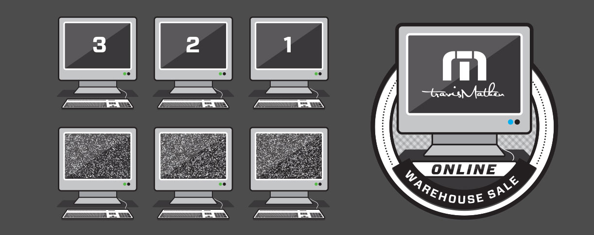
Final Logos

Next