- Role: Art Direction, Design
- Client: AFS Printing
- Duration: 06/14 – 03/16
AFS Printing

AFS Printing
- Role: Art Direction, Design
- Client: AFS Printing
- Duration: 06/14 – 03/16
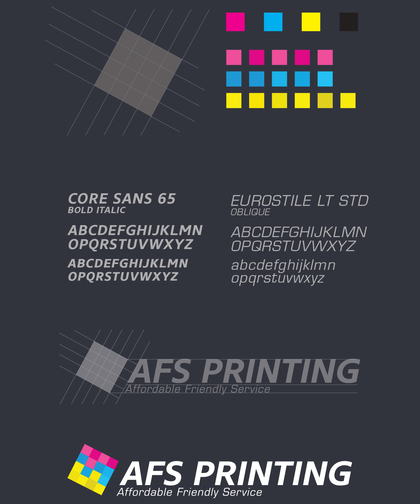
It’s not often a designer gets to rebrand the company they work for and I took it as a personal challenge to bring AFS Printing into the modern age. When I first began work at AFS the existing identity had been in place since the companies creation in 1990. It was western themed and rightfully so, before the widespread use of the internet the horse town of Norco California needed a reliable printer who fit in well with the community and for many years the company was a success. But times change due to the recession it was time to upgrade to a more professional modern aesthetic.
Branding
Using the 4 primary colors for all print production I was able to generate a cascade of hues assembled in a pixel line grid mimicking the diodes of an LED and paying homage to the roots of 4 color process. The primary typeface Core Sans was the ideal choice considering the crisp contours and bold command of the page. The lack of lower case characters, however, proved to be troublesome, fortunately, Eurostile fit perfectly as our secondary font and completed the group.
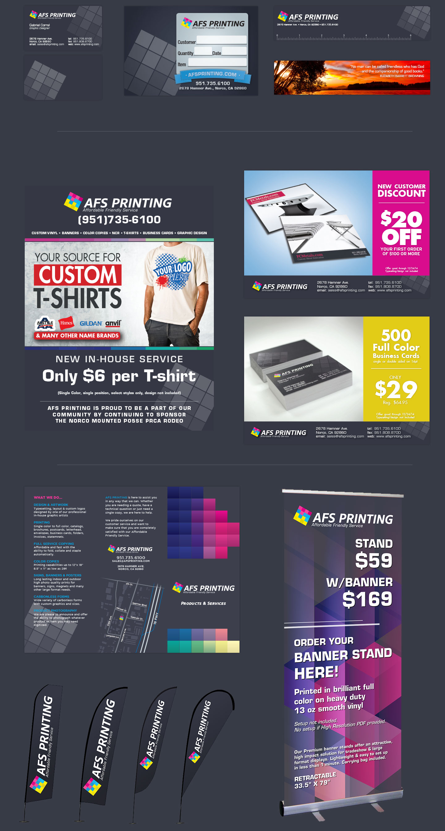
Corporate Collateral
Along with new branding came a multitude of corporate collateral to increase brand awareness both with existing customers and cold leads. The western cowboy was out and the new modern was in. AFS was able to expand it’s customer base 27% last quarter and has never been more productive or profitable.
Next